The National and University Library of Slovenia is one of the country’s leading cultural, educational, and research institutions. Its website must therefore serve a wide range of audiences, including members and students, visitors and tourists, researchers, publishers, librarians, journalists, schools, donors, and businesses.
Each group arrives with a different goal and a different level of familiarity with the library. The project was therefore not simply a visual refresh, but the creation of a new digital platform connecting a public information portal, key user journeys, an online store, a content management system, and the accessibility requirements applying to public-sector websites.
The challenge: turning a complex website into clear user journeys
The existing website no longer met the needs of modern users or the editorial team. It was not properly optimised for mobile devices, and on smaller screens even accepting cookies could be difficult. Navigation was complex, information was hard to find, and the solution did not meet the expected level of web accessibility.
At the same time, NUK publishes a large volume of content with very different lifespans. News, events, and featured content change frequently, while public information, policies, regulations, calls for applications, and other documents must remain permanently and reliably accessible.
Some of the English-language content was incomplete, while the homepage included elements that had largely been retained for historical reasons and no longer supported users’ most important tasks.
The challenge was therefore twofold: to simplify access to everyday services for users, while giving editors a system in which they could publish, update, and connect content quickly and independently, without unnecessary technical support.
The solution: a digital platform designed around people
The new website is organised around the reasons people visit NUK.
Members and students look for information about registration, opening hours, loans, reading rooms, and reservations. Visitors are interested in guided tours, cultural heritage, exhibitions, and events. Researchers need access to catalogues, digital materials, open-access resources, and information about projects, while professional audiences are looking for training, examinations, and specialist services.
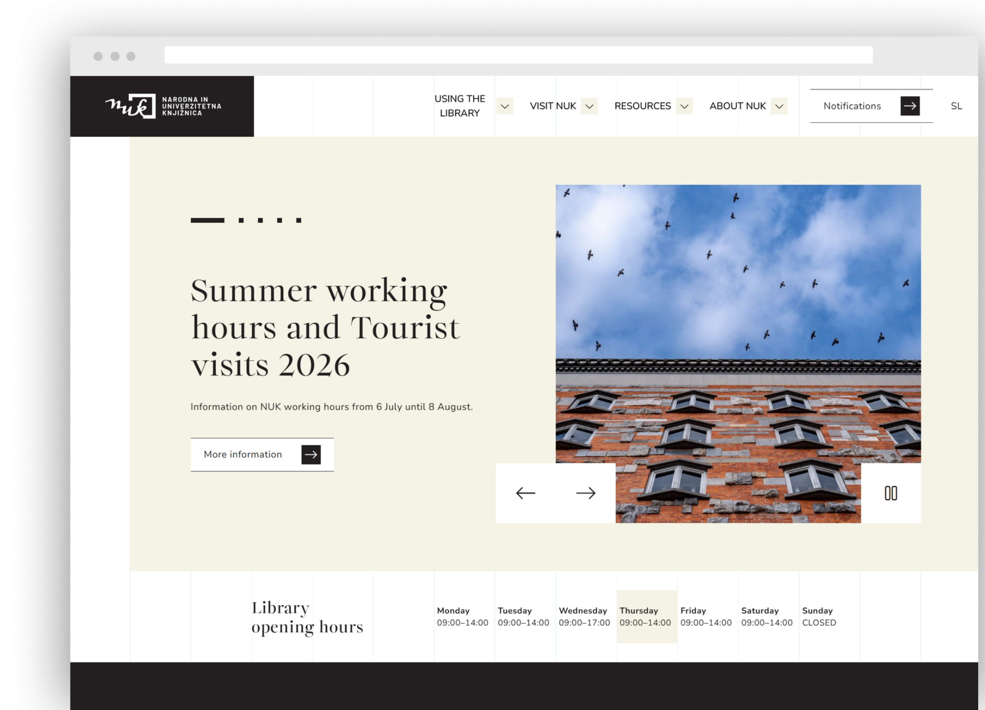
Instead of requiring users to understand the library’s internal organisational structure, the new information architecture guides them directly towards a specific task. The homepage highlights clear entry points, essential information about opening hours, and current content.
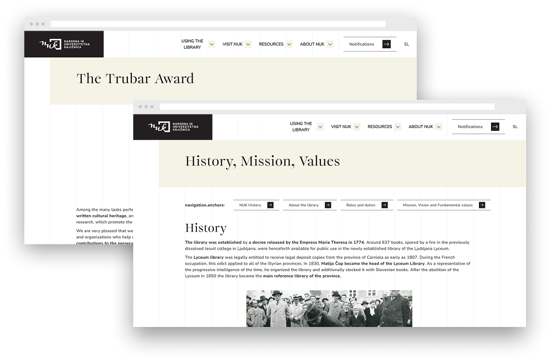
On individual pages, complex information is broken down using cards, step-by-step content, anchor links, accordions, and clearly structured data. This makes even longer and more demanding content easier to understand and navigate.
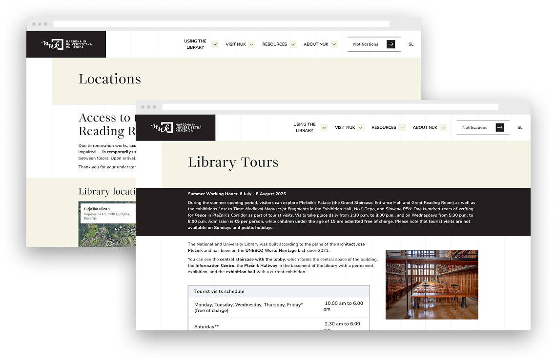
Content pages are designed to support different points of entry. Users can begin with an overview of the programme, an individual exhibition, or a specific event without losing their sense of where they are within the website.
A consistent system of headings, cards, links, and content highlights connects current announcements with longer-term information about the library’s collections, services, and activities.
Accessibility from the first concept to the final review
The accessibility-first approach shaped every stage of the project, from information architecture and design to development, testing, and final validation.
We paid particular attention to:
- a clear content structure that remains understandable without visual cues,
- sufficient colour contrast and appropriately sized interactive elements,
- clearly visible focus states and keyboard navigation,
- a semantic heading hierarchy and appropriate labels for screen readers,
- predictable menu behaviour,
- accessible forms and error messages,
- content zoom of up to 400%,
- responsive tables and images,
- proper focus management in the mobile menu,
- closing overlays and pop-ups using the Escape key,
- consistent labelling of external links and PDF documents.
Accessibility therefore remained not an abstract requirement, but became a series of concrete decisions embedded in the user interface.
The comprehensive accessibility audit served as a shared working record for the UX, design, and development teams. Findings were continuously documented, prioritised, resolved, and retested. We also recorded the limitations of external solutions and integrations where not all elements could be directly controlled within the main portal.
User journeys that work across devices
For service-oriented pages, simply publishing the information was not enough. Users needed to understand it quickly, recognise the differences between available options, and continue to the next step without unnecessary friction.
This is particularly important for information about registration, membership renewal, borrowing materials, accessing electronic resources, and using reading rooms. We therefore divided the content into clear sections supported by direct links and practical instructions.
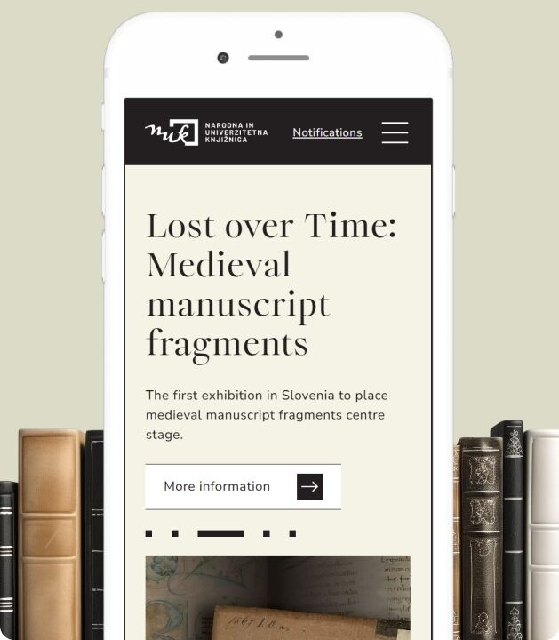
The same hierarchy is preserved across desktop and mobile devices. On smaller screens, multi-column layouts become a clear sequential flow without losing content, meaning, or functionality.
Design that supports the content
The visual system combines a restrained, high-contrast colour palette, editorial typography, a modular grid, and generous use of white space.
Photography of the architecture, library spaces, and collections plays an important role without overpowering the information or functionality. The visual identity supports the character of the institution while allowing users to access content without unnecessary distraction.
A clear heading hierarchy, repeatable card patterns, consistently designed buttons, and subtle colour accents help users stay oriented. The system is distinctive enough to express NUK’s identity, while remaining flexible enough to support news, events, services, long-form information pages, forms, tables, and data visualisations.
Functional displays are another important part of the design system, particularly where users need to understand a larger volume of information quickly. One example is the Great Reading Room occupancy overview, which presents seat availability through a clear legend, statuses, and spatial arrangement.
For data-rich displays of this kind, it was important that information was not communicated by colour alone. Individual statuses are therefore supported by icons, text labels, and a clearly structured legend.
The integration also highlighted the importance of coordination between the main portal and external systems. Where individual elements could not be directly adapted, we documented the limitations and assessed which improvements could be implemented within the available technical environment.
The online store as part of a unified digital ecosystem
The redesigned online store continues the visual and interaction language of the main website. Rather than functioning as a separate solution, it feels like a natural extension of NUK’s wider digital experience.
Users can browse publications and other products, explore collections and categories, view recommendations, and move clearly from product discovery to purchase.
Consistent navigation, search, user account, and shopping cart elements maintain the feeling of a unified service. On mobile devices, key functions remain directly accessible from the main navigation, while content adapts to narrower screens without losing clarity.
Product pages bring together the product description and price, stock information, delivery and collection options, payment methods, and related products in one place.
Frequently asked questions and purchasing information reduce uncertainty, while clear connections between categories, products, and recommendations make the catalogue easier to browse.
A modular CMS for everyday editorial work and future growth
The new technical foundation is based on reusable components and clearly defined content types.
Editors can independently manage news, events, calls for applications, featured content, documents, forms, and other sections, while meaningfully connecting related content. Instead of building each page from scratch, they use tested components that provide greater visual and editorial consistency
The project also included support with the preparation of Slovenian and English content, as well as training for the editorial team on how to manage the system.
The platform was designed with future development in mind. An AI assistant, room reservation services, an expanded online store, and other digital services can be added in the future using the same content, design, and technical foundations.
This approach reduces fragmentation in the user experience and simplifies the platform’s long-term maintenance.
Our role
At Creatim, we were responsible for researching and defining user priorities, preparing the information architecture and UX concept, designing the visual and component system, developing the front-end and back-end solution, and setting up the modular CMS.
Our work also included implementing the agreed functionality, quality assurance, support with user testing, establishing the foundations for SEO and analytics, supporting content entry, training editors, and carrying out a comprehensive accessibility audit with iterative resolution of identified issues.
The result: a clearer, more inclusive, and more sustainable portal
The redesigned digital experience gives users a clearer path to the information and services they need, from registration, opening hours, and borrowing to reading rooms, catalogues, events, professional resources, and online purchases.
The responsive design supports modern devices and browsers, while a unified visual language connects the main website and online store into a consistent digital experience.
For editors, the new platform provides a more structured, independent, and sustainable way of managing content. For NUK, it represents a strong digital foundation that can evolve alongside its services.
The redesign demonstrates that accessibility is not a limitation on good design, but one of its most important measures.
Facing a similar challenge?
Together, we can create a digital experience that works better for your users and your team.
Get in touch